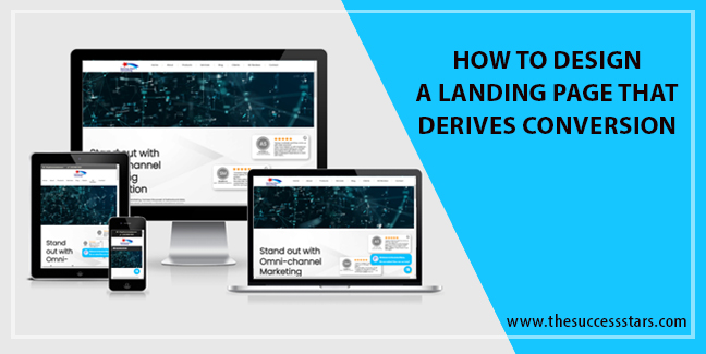
Looking for designing a landing page that drives conversions? Keep reading till the end and unplug the secret of designing a landing page that fits into your marketing and business growth objectives.
Introduction to Landing Pages and its significance
A landing page is a web page created for marketing and advertising purpose.
The landing page has its own reasons for existence. It can be used for ad campaigns, promotions, sales, or information for the visitor on your website. Its primary use is to convert traffic. Also, it helps in conversion tracking to track the success of a particular product, goal, or keyword.
How Landing page helps conversion
A high converting landing page guides the visitor to subscribe, signup, buy or join just with the click of a button (CTA).
Best Practices for designing a landing page for conversion
It takes more than an attractive design to create a conversion-driven landing page.
If you want to create effective landing pages that get into the audience head, keep in mind the following points.
Be specific: Create a specific landing page for each offer for providing a quality experience for visitors and driving conversions with a targeted message that matches each user’s need.
Simple CTA: It is the action you want your visitor to take like fill out a form, sign up for a newsletter, download an eBook. Keep it simple. Call to action (CTA)can be present in the headline text as well as the button text. Some example of CTA is “submit”, “download your free marketing guide”, “Get Started Today”, See Plans and Pricing”
Brevity: A landing page provides essential information that catches audience interest. Keep the headline of your landing page very brief to confirm the offer and a sub-headline to highlight the value proposition. It can also be an image that explains the product or service. For example “Get Started Today- Learn how to get more views on your next install post”. Add catchy fonts and colors to implicit information to the visitor.
To the point description: Add an eye-catching yet precise description of your product or service. It can be a sales pitch video, or maybe a form.
Target Audience: While designing a landing page keep in mind the objectives of your customers, their competitions, purpose, intent, focus, industry, niche, perception, value proposition, and concerns that can be addressed with your product and service offering.
User Platform: Your message on the landing page must take into account the platform your user is coming from
like Google, Twitter, or Facebook.
Clear objective: Determine the objective you want to accomplish. It can be growing your email list, promote a new product, Promote a discount on a subscription service, and so on.
Keyword Research: Add appropriate keywords that people may use while looking for sales, products, events, or discounts.
Focus on quality: Use of high-quality content which is relevant to the audience. High-quality content inspires trust and instills brand loyalty.
Minimal use of hyperlinks: Hyperlinks are the exit points that leave your page. Great landing pages have limited hyperlinks to funnel visitors in the desired path.
Target conversions: The purpose of a landing page is to give an easy path to visitors to convert. If your goal is form submissions, then the form must be very attractive, if it is downloaded, make the button very attractive to click.
Intuitive design: Appearance alters perception Seamless design of the landing page supports easy navigation to help the visitor with all required information to ease conversion.
Good engagement: Choice of mind-bending words makes all the difference for engaging your audience. Words like “you” “Imagine” create interest in the minds of readers.
Video Clips: The video landing page connects easily with the audience and makes complex things appear easy and at the same time entertaining.
Entice with Offers: Add a compelling offer for your visitors on the landing page. This helps to get conversions.
Easy to understand: It is estimated that you have about 8 sec to convince users. Hence propose a compelling value proposition that catches the essence of your service offering
Catchy Images: An attractive landing page contains bright, catchy visual cues like an arrow, or bright buttons to clue the visitors into what steps they should take.
Match Keywords: Use the same keywords in your landing page as your PPC ad text so that there is obvious connection and continuity. Your visitors must get what they are searching for instantly rather than look for it on generic pages.
No Lengthy Forms: While designing killer landing pages don’t expect visitors to fill out more fields (ideally not more than seven fields) in your forms like date of birth and phone numbers, else they may not complete your offer. You can ask for more information on the thank you page.
Colour Theory: Different colors depict different moods. Many marketers suggest the use of color theory in your site design. Bright colors for buttons like green or red increase landing page conversion. Check colors, placements, and sizes that fit your landing page. See what works.
Clickable share Icons: Great landing pages makes generous use of sharable buttons. This not only increases the chances of getting your content shared across all the social channels but also gives a good customer experience for people who want to share their recent purchase experience or a resource with their networks. You can place the social button on the thank you page. Your
likes and follow buttons can also work as a word-of-mouth endorsement.
Recommendations: Use of Trust signals, like logos of well-known companies you’ve done business with, awards you’ve won, and tie-ups and associations you are a member of, instills trust. Such trust signals comfort, reassure visitors and give them the confidence to convert into customers.


